My Role
Design Lead
Timeline
6 months
Team
Project Managers
Designer
Web Developers
Responsibilities
Research
Design Direction
Interaction Design
Visual Design
Prototyping
Responsibilities
Research
Design Direction
Interaction Design
Visual Design
Prototyping
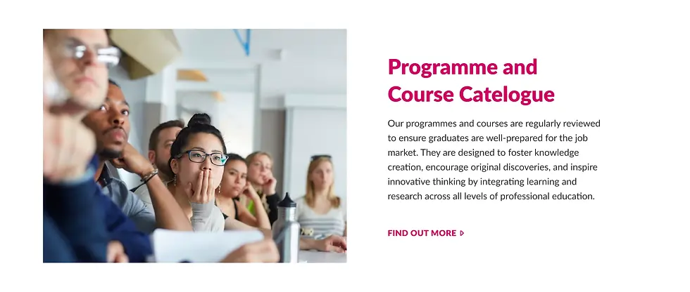
Overview
As the design lead for the City University of Hong Kong (CityU) website redesign, I partnered with a designer and a development team (hired by CityU) to revamp their digital presence. Our main objective was to update the website to reflect CityU’s new brand identity and highlight its world-class status, while meeting the needs of diverse website users.
The old website had issues like confusing navigation, an outdated design, and hidden content, making it difficult for users to find information and failing to express the brand’s personality. We wanted to create an effective entry points for users first visiting the website to easily discover the content meaningful for them. The website also needed to be responsive for seamless access across different devices, improved usability, and to boost the university’s reputation.
High-level Goals
01
Improve usability by implementing a responsive redesign for better cross-device functionality and a user-focused approach.
02
Reinforce brand identity and expand reach by showcasing CityU’s updated brand through logo integration and visual design that appeals to prospective local and international students.
Establishing a Solid Foundation
To initiate the redesign, we conducted several discovery activities to understand the current state of the website, identify potential areas for improvement, and determine how the redesign could achieve the desired outcome.
1. Understanding Business Objectives
We collaborated with internal stakeholders to determine their expectations and understand organizational goals.
2. Consulting Industry Standards and Learning from Competitors
We used established usability best practices to provide a strong, evidence-based foundation for our approach, the research also pointed us to areas we could learn from competitors.
3. Uncovering Existing Usability Problems Encountered by Users
We evaluated the website’s usability to identify specific pain points and obstacles users faced.
4. Familiarizing with the Brand and Discovering its Appeal
We ensured a clear understanding of the brand’s core values to represent them accurately.
5. Mapping Target Audience Groups and Their Needs
We identified the diverse user groups to create a website that met their specific needs.
01
Discovery
01
Engaging Stakeholders to Understand Expectations
Despite limited engagement from internal stakeholders, the feedback received offered foundational insights into institutional priorities. These priorities include:
-
Promoting academic achievements: Showcasing and highlighting the university’s academic successes and accomplishments.
-
Enhancing credibility: Building and reinforcing the university’s reputation and standing.
-
Utilizing the website as the first entry point: Recognizing the website as the primary platform for target audiences to initially interact with and explore the university.
02
Consulting Industry Standards
To ensure our redesign was based on sound principles, we used established usability best practices. This included considering insights from the Nielsen Norman Group’s report on higher education websites. These widely-accepted standards provided a strong foundation for our design recommendations. By aligning our work with these evidence-based design principles, we aimed to create a website that meets the needs of various users and adheres to industry standards of overall usability (making the website easy to use for everyone).

03
Uncovering Existing Usability Problems
To understand user pain points with the CityU website, we used two methods: an online survey and informal usability testing.
-
Online Survey: This survey provided a general overview of user satisfaction and highlighted recurring problems with website usability (ease of use) and content quality/presentation. While it identified trends of user dissatisfaction, it didn’t explain why users behaved in certain ways. In other words, it showed what the problems were but not why they occurred. This established a baseline of general dissatisfaction.
-
Informal Usability Testing: We observed friends and colleagues performing key tasks on the website. This provided qualitative feedback and gave the client direct insight into user frustrations. Unlike the survey, this allowed us to observe users’ struggles firsthand.

While online surveys don’t reveal the underlying reasons for user behavior, the survey results clearly indicate the website isn’t meeting user needs regarding ease of use and content quality/presentation. This shows a clear trend of the site not adequately serving user needs in these areas.
Learning from Competitors
Based on the research report, a competitive analysis of other universities provided key references for improving CityU’s website. This analysis focused on how competitor universities successfully structured their online platforms, specifically examining intuitive navigation, credible content, and relevant user experiences tailored to their audiences.
-
Audience-Centric Content Organization: Competitors organized content by target audience (e.g., prospective students, parents, alumni), allowing users to quickly find relevant information. This is important because different groups have different needs and priorities.

Competitor websites effectively categorize content under labeled sections, such as ‘Prospective Students’ or ‘Alumni,’ ensuring each user group can easily access the information most relevant to their needs.
-
Clear Hierarchies and Simple Navigation: Competitors clearly distinguished between primary (most important), secondary (less important), and supplementary (additional) website functions. This hierarchical structure streamlined navigation, reducing user confusion and improving the overall experience. By presenting information in a clear order of importance, users can more easily find what they are looking for.
Informal user testing revealed key challenges and user feedback to guide the design process.

Primary, secondary, and supportive functionalities are clearly sectioned with clear hierarchy under simple label names.
-
Building Credibility and Engagement: Competitor websites effectively used student testimonials, quotes, and stories, combined with statistics and data, to highlight the quality of education and campus life. This approach made the institutions more relatable and trustworthy, helping prospective students imagine themselves as part of the university community. This type of content helps build trust and encourages prospective students to engage with the institution.

Quotes and stories from real students add to the credibility of the education quality of the institution, helping prospective students picture themselves.

Facts and figures add tangible value to the university education. They are presented strategically alongside relevant content with the aim to “close the deal”.
The homepage feels cluttered, with too many options competing for attention. It’s hard to figure out where to start or what to click next. And I don’t even understand what to expect clicking those links, so randomly named with words… that I don’t even understand…

Key Leanrings
Intuitive Navigation
Prospective students often browse multiple university websites, becoming familiar with typical navigation patterns. Therefore, avoid novel naming conventions and navigation structures to prevent user frustration. Clear, logical site structures and simple language in menus and links will enhance the user experience.
Building Confidence
The website should instill positive feelings about the university, highlighting its strong reputation, vibrant student life, and global connections. This confidence will increase user interest in the university.
Establishing Credibility
A university’s website must project trustworthiness, featuring accurate, honest information that reflects the institution’s high quality. Website design, wording, and content should align with the university’s brand to establish consistency and build credibility.
Delivering Relevance
The website should cater to different user groupsby providing relevant, useful information that facilitates informed decision-making.
The layout of the admissions page is overwhelming, with important details like deadlines and requirements buried in dense text. It’s difficult to quickly find the information I need.

It looks like a very old-fashioned website. It doesn’t induce confidence in me while I am browsing it. I cannot see myself wanting to apply for this boring university… unless the programs are good? but I don’t know…
Understanding the Underlying Reasons
Based on user feedback, a thorough evaluation of the existing CityU website was conducted to identify where the exisiting website are causing the usabiity problems. This analysis supplemented the user feedbacks be giving a more detailed context.
The goal of this evaluation was to understand why the website was underperforming and to determine how to create a more effective online experience. The main problems identified were:
-
Fragmented Information Architecture: Users were frequently redirected to various sub-sites early in their website journey. This dispersed important information across multiple locations, making it difficult to find key details like program information and admission requirements in a clear and unified manner. The provided sitemap visually demonstrates how this redirection to sub-sites hinders easy access to crucial information.

The sitemap highlights how users are directed to sub-sites early in their journey, dispersing crucial information across multiple sections.
-
Navigation Inconsistencies: The main menu displayed inconsistencies in both its visual presentation and its behavior, which frustrated users. These inconsistencies made navigating the site confusing, particularly when users needed to return to important sections or find specific content.

There are visual and behavioral inconsistencies in the main menu, which caused user frustration.
-
Lack of a Meaningful and Purposeful Entry Point: The homepage acts as a mere directory of links (often without providing enough context for users) instead of a proper introduction to the university. It doesn’t showcase CityU’s brand, value, or achievements, failing to make a strong first impression.

The homepage primarily serves as a collection of links, lacking clear context and engaging content.
Key Observations
Lack of Modern Appeal and Credibility
The outdated website design led test users to question the university’s quality and innovation, which negatively impacted their view of its programs and overall reputation.
Inaccessible Key Information
Information is often presented as an overwhelming block of text with unclear or unexpected links, forcing users to work hard to find what they need.
Cluttered Homepage
The homepage has too many options and unclear navigation. This overwhelms users and makes it difficult for them to find what they need.
Setting Clear aGoals
Following the initial discovery phase, three core goals were established to guide the website redesign. These goals influenced the website’s structure, functionality, and messaging, ensuring the final design was user-focused, effective, and consistent with CityU’s objectives.
Providing Proper Signposts and Guidance Along the Path
Clear signposts, like introductory paragraphs and contextual links, helped users navigate complex pages. This approach set user expectations for page content, resulting in a more intuitive experience.
-
Contextual Entry Points: Each link to deeper content had a short introductory paragraph to accompany with. This helped users understand what information the link would lead to. Button links started with a verb (an action word) to clearly show the action and guide users through the website.

Related links are positioned together within the same context, helping users explore relevant content seamlessly.

Related content pathways are grouped together with relevant context to enhance content discoverability.


Scaling Credibility with Modular Design
To better manage the CityU website’s size and complexity, a modular design system was implemented. This method emphasized consistency and adaptability, addressing challenges such as decentralized content management and ensuring the site’s long-term upkeep.
This system included more than 100 reusable components, designed to adapt to different screen sizes. This enabled the creation of diverse pages while preserving a unified look and feel. By connecting shared content (like important figures and department details) to a central, reliable source, updates could be applied smoothly, maintaining the website’s accuracy and trustworthiness.

Redesign goals
Relevant (Meeting User Needs)
The website’s content should address the specific needs of the university’s key audiences, including prospective students, donors, alumni, and other stakeholders. The website should prioritize delivering useful, tailored information to help users make informed decisions relevant to their specific situation. By ensuring relevance, the website will better connect with users, encouraging engagement and establishing a sense of purpose.
Credible (Trustworthy and Professional)
The website should project confidence, trustworthiness, and professionalism, reflecting CityU’s reputation as a high-quality institution. By presenting information clearly, accurately, and authoritatively, the design will build user confidence in the university’s quality, achievements, and commitment to excellence. It should be presented in a young and bold innovative spirit
Intuitive (Easy to Use)
The website should offer a simple and smooth experience for all user groups. Users should be able to easily navigate the site and quickly find the information they need without difficulty. A clear and logical structure will simplify the user experience, allowing them to easily find programs, admission information, or other resources. Avoids overwhelming users with complex navigation and allows them to focus on their goals for using the site.
Goal 01
Intuitive
Writing the Design Brief Has to be a Design Process
Prototyping proved invaluable for aligning stakeholders and building trust. By creating tangible representations of the design, abstract ideas were clarified, and client expectations became concrete. This process fostered mutual understanding from the outset, enabling informed feedback and a shared understanding of the design vision. This experience highlights the effectiveness of prototyping as a tool for stakeholder communication and agreement in any design process.
Continuous Collaboration: Overcoming Cross-Functional Barriers
Using Agile methodologies (weekly stand-ups, sprint reviews, and retrospectives) and collaborative tools (shared whiteboards, project management software) ensured consistent communication between design and development, leading to project success. This approach fostered regular dialogue, allowing quick adaptation to changing requirements and preventing misunderstandings.
Post-Launch Iteration: Necessary for Long-Term Success
The lack of a formal post-launch feedback phase emphasized the importance of ongoing user experience refinement based on real-world usage data. Future projects should incorporate a feedback mechanism for continuous improvement, allowing the design to adapt to user needs. This highlights the need for continuous improvement based on user feedback.
Balancing User Needs and Organizational Constraints: Requires Strategic Negotiation
Internal resistance to change and organizational limitations restricted some design enhancements. This highlighted the need for careful negotiation, balancing user-centered design principles with practical constraints to achieve effective and sustainable results. This recognizes the need to balance ideal designs with the practical realities of implementation within an organization.
Solving Prospective Students’ Pain
We recognized that prospective students were experiencing difficulties obtaining admission and program information. Despite our attempts to advocate for these students and involve the project team, the existing organizational structure and lack of institutional commitment prevented us from directly migrating information to the university website. Therefore, we pursued the next best solution. Understanding that the website serves as the university’s primary point of contact, we gathered all necessary pathways and presented them with relevant contextual information, rather than simply providing links as on the old website.
Each link is introduced with a clear and concise paragraph, helping users understand what to expect and making it easier to find the information they need.

The redesigned main navigation aligns with CityU’s focus on education and research, providing clear pathways for users. The supplementary navigation enhances discoverability without disrupting the core message of the website.


Vibrant photo galleries showcase the dynamic and inclusive student life at CityU.
Making it Tangible
To showcase the university’s value, tangible evidence of CityU’s achievements was presented. This included quantifiable data such as faculty awards, research milestones, and student success rates. Highlighting these successes made the university’s impact clear and built trust by demonstrating concrete results.
To further enhance credibility, factual information was accompanied by contextual references and links to reputable sources. This allowed users to independently verify the information, increasing transparency and building confidence in the university. This is especially important for prospective students making crucial decisions about their future.
By grounding its message in verifiable data and providing transparent sourcing, we helped to reinforce CityU’s reputation as a trustworthy institution. This approach ensures that prospective students have access to accurate information and can make informed decisions.
Goal 02
Credible

We studied a large number of sub-sites to map the existing content to the redesigned website.
Achieving Consistency and Credibility in Visual Design
A cohesive design system was created for CityU to visually represent its mission of “Making the Difference.” This involved unifying CityU’s visual identity to communicate this message clearly and consistently. The design blends modern aesthetics with clarity and usability, enhancing the institution’s credibility.
Through collaboration with CityU, visual elements were developed that balance a fresh feel with reliability. Design elements like utilizing the dynamic shape of the logo identity and motion reflect the university’s dynamic and youthful character while maintaining institutional trust. Clear typography, icons, and imagery ensure the website tells a cohesive and credible story about CityU’s role in education and research. This reinforces CityU’s brand promise of “Making the Difference” by visually showcasing its impact and contribution.


Quick bites of data highlight CityU’s achievements and rankings, making its strengths tangible to prospective students.
Dynamic Layout
The homepage of the CityU website reflects the university’s youthful and energetic nature through its content layout. Inspired by the CityU logo, supporting shapes surround content to create a fluid and energetic look and feel. This design choice visually communicates the university’s dynamic and innovative character while enhancing the user experience.
The shapes serve multiple functions. They group related content together, making it easier for users to navigate the page and find the information they need. They also add a sense of depth and dimension, creating a more engaging and visually appealing layout.
The shapes are used in a variety of ways throughout the homepage. They frame headlines, highlight key information, and even create pathways for users to explore different sections of the site. This consistent use of shapes helps to create a cohesive and unified design that reinforces CityU’s brand identity.
Overall, the content layout on the CityU homepage is designed to reflect the university’s youthful and energetic nature while also providing a user-friendly and informative experience.
-
Single Source of Truth for Shared Content: Certain information (like key figures, contact information, and personal stories) needs to appear in multiple places. To keep this information consistent, we defined these shared information types, determined who is responsible for them, and mapped how they connect across the site’s components. This “single source of truth” approach prevents inconsistencies and ensures all versions of the shared content are accurate and up-to-date.

We identified key shared content types, such as department contacts and figures, and created a system for maintaining consistent, up-to-date information across the site.

Figures presented with contextual reference links reinforce transparency and allow users to discover more.
Provide Relevant Content Along the User Journey
We analyzed existing website and subsite content to locate and resurface previously buried information. We created a structure to ensure users can easily find relevant, helpful, and accurate information. Where relocation of content wasn't possible, we created clear references to its existing location.
-
Content Structure and Relationships: We diagrammed how different content sections connect. This creates a logical flow and makes all information easier to find during the content migration process and subsequently for the target audience.
Goal 03
Relevant
Making it Human and Personal
To make the CityU website more engaging and relatable, we focused on humanizing the content by including authentic voices. This was achieved by featuring stories and experiences from current students, staff, and alumni. These personal anecdotes, coupled with vibrant photo galleries, help prospective students connect with the university on a deeper level and envision themselves as part of the community.
By showcasing real experiences, the website aims to resonate with visitors and support their decision-making process by fostering an emotional connection. In essence, the goal was to move beyond presenting facts and figures (which we needed to do as well), and instead, create a website that reflects the real-life impact of CityU through the voices of its people. This approach makes the university feel more accessible and personal, rather than just a formal institution.
Results
The project aimed to create a more intuitive, relevant, and credible online presence. Through collaboration and iterative design, the project simplified navigation, improved content accessibility, and established a unified visual identity.
Key project outcomes included:
-
Responsive Design Transition: Moving from a fixed-width layout to a responsive design significantly improved the user experience on various devices, addressing the increasing demand for mobile-friendly access to information.
-
Visual Consistency & Brand Expression: The redesign achieved visual consistency across CityU’s online platforms. Standardized user interface (UI) elements created a cohesive and modern design reflecting the university’s evolving identity. This maintained credibility and ensured a forward-thinking brand image.
-
Streamlined Content Structure: Restructuring the website content made it more intuitive, enabling users to easily find relevant information. This improved the user experience and laid the groundwork for more efficient future content management.
-
Industry Recognition: The website won Silver for Best Rebrand of a Digital Property at the Transform Awards Asia Pacific 2019. This recognized the project’s design and high quality.
However, the project faced limitations and unresolved challenges:
-
Internal Resistance and Organizational Challenges: Resistance from within the university hindered the implementation of some structural improvements. Political factors prevented centralizing program information, impacting the creation of a unified user experience.
-
Fragmented Program Information: Despite the redesign, program details remained scattered across different sub-sites. This made it difficult for users to compare academic programs in one place and hindered a holistic view of academic offerings.
-
User Journey and Ease of Use: While the content structure improved, internal barriers still constrained the user journey. Navigating complex program information remained difficult, preventing straightforward access to crucial details. (The user journey refers to the steps a user takes to interact with a website or service.)
04
Familiarizing with the Brand and Discovering its Appeal
Our branding team helped CityU to refine its core messages which we needed to manifest in the website redesign. The redesign aimed to reflect its core values of creativity and innovation across disciplines, from business and engineering to the arts. The university emphasizes developing student talent and generating practical knowledge for social and economic advancement, and aims to be a top global university recognized for its research and professional training. CityU wants to be perceived not as a conservative institution with a long tradition, they are dynamic, innovative, bold, and smart.
We also studies main competitors’ visual expressions and messages to carve out a space where CityU uniquely stands.
05
Mapping Target Audience Groups and Their Needs
To make sure the redesigned website worked well for everyone, we first identified the main types of users and what they needed. We did this by talking to people involved in the project, looking at existing information, and studying what similar websites do. This helped us define the key user groups and understand their specific needs.
02
Goal Setting
03
Design & Refine
Revamping the Information Architecture
To improve user experience, the CityU website’s information structure was redesigned. Navigation and content discovery were simplified by implementing more logical starting points, clearer labels, and simpler content organization.
The main navigation now reflects CityU’s educational focus with items clearly labeled for key target audiences. The secondary navigation allows for more detailed exploration. The supplementary navigation Provides key pathways to key functional items. This improved structure aims to reduce user frustration and create a smoother browsing experience, making the website a more effective guide for its key audiences.
All landing page content now addresses the immediate concerns of the target audiences, providing clearer jumping-off points to the information they need.
02
Improving Credibility through Appropriate Design and Content
It prioritized establishing trust and professionalism to reflect the university’s high standing. This involved ensuring clarity, accuracy, and authority in information presentation through credible sources, concise language, and a unified visual identity.
03
Improving Content Relevance
We redesigned the CityU website to better connect with its target audience. By prioritizing clear, relevant information in a logical and engaging way, we aimed to improve usability and help prospective students make informed decisions.
07
Learnings


City University of Hong Kong – 2020
Transforming the Digital Presence of a World-Class University
01
To Make Content Discoverable
Our goal was to create a website that was easy for all users to navigate and find the information they needed quickly and easily. To achieve this, we simplified the navigation, reorganized the content, and added clear signposts and guidance to help users through the site.
05
How we Got There

CityU Shape
The shapes serve multiple functions. They group related content together, making it easier for users to navigate the page and find the information they need. They also add a sense of depth and dimension, creating a more engaging and visually appealing layout.

Use of Colours
The Brazil bougainvillea, CityU’s flower, represents the university’s youthful energy. Its vibrant colors inspired the university website’s color gradient. This gradient highlights key information, guides site navigation, and adds visual depth. Using the flower’s colors visually communicates CityU’s dynamic and innovative nature while improving user experience.
04
Final UI


Designing the Design Process
To establish a strong online presence for the CityU website, a meticulous design process was implemented. This presented challenges as the client had limited experience with responsive web design, the development team lacked advanced front-end skills, and content creation resources were unavailable. These obstacles were addressed through transparent communication, collaborative teamwork, and adaptable design and development methodologies, ultimately achieving a successful outcome.
Good Design/Development Collaboration through Agile Sprints
Collaboration between design and development teams was crucial due to the development team’s limited frontend design experience. Agile sprints broke the project into smaller tasks, providing clear instructions for each development stage. This iterative process enabled quick responses to changing client needs while maintaining design consistency. This smooth team transition minimized revisions and ensured both teams worked towards shared goals. It also facilitated adaptation to the developers’ frontend challenges, ensuring goals were met.

Collaborative discussions among the design and development teams, refining layout components to ensure a user-friendly and cohesive experience.

Visualizing the project timeline through agile sprints, ensuring continuous progress and alignment with CityU's evolving needs.
Utilizing Sketches and Wireframes for Early Exploration and Documentation
During the initial design phases of the CityU project, sketches and wireframes were essential for rapidly exploring design options. Sketches of key pages and features facilitated brainstorming and testing low-fidelity solutions. Wireframes then established the website's structure, planned content layout, and defined necessary templates and components, ensuring a strategic, user-centered approach.
Internally, these wireframes were crucial for collaborating with the developers, clarifying requirements, documenting content types, locating original content sources, and defining content goals, especially for new content. Due to technical limitations regarding available components, the detailed wireframe documentation proved invaluable for identifying existing component sets and ensuring the project stayed on track and within budget.

Rapid ideation and early-stage design exploration through hand-drawn sketches, enabling quick iteration and alignment with stakeholder vision.

Mid-fidelity wireframes showcasing the planned structure and layout of key pages, providing a foundation for further refinement and user-centered design.
Responsive Prototypes to Bridge Knowledge Gaps
To better illustrate the principles of responsive design, we developed early prototypes. These prototypes gave both the client and the development team a clear understanding of the website’s functionality across various devices. By creating tangible examples early on, we aimed to ensure the final design met user expectations and minimize the chance of misunderstandings later in the project. This early prototyping phase was essential for creating a shared vision for a responsive website among all those involved.

Interactive responsive prototypes across multiple devices, demonstrating how the website adapts seamlessly to different screen sizes and user contexts.
06
The Outcome
Engaging, Realistic Photography for Storytelling
Photography effectively showcased CityU as a vibrant and authentic environment. By using photos that captured genuine moments of campus life, it allowed prospective students and others to envision themselves as part of the CityU community.

Purposeful Motion to Convey Dimensionality
To showcase CityU’s innovative and youthful spirit while maintaining usability, subtle animations and transitions were integrated into the website’s design. These dynamic elements enhance the user experience without compromising usability. This strategic approach to visual appeal and practical functionality strengthens the site’s credibility through purposeful interactions that effectively communicate the CityU brand.
Empowering the Client with Workshops
To ensure CityU’s long-term website sustainability and enable their team to independently manage and update it, practical workshops were conducted. These workshops provided the CityU team with actionable guidelines and clear content management documentation. The team learned how to use modular components, such as creating or updating program pages, to confidently manage the site after launch. Follow-up sessions addressed any issues and incorporated their feedback to improve the process, empowering CityU to actively manage the website’s future.

Stories from students, staff, and alumni create a personal connection, making CityU more relatable and engaging.

Despite our research, we could not definitively determine whether the identified usability issues pointed to clear, specific areas for improvement. It is possible that the original website adequately served its users in their specific contexts. However, without quantitative data (as the university website lacked relevant analytics), we proceeded with the assumption that enhancing overall content discoverability would be a beneficial approach for this redesign.

Prospective Students
Seek information on programs, admissions, scholarships, and campus life.

International Audiences
Seek iInformation on visa requirements, housing, and cultural integration. Details on research opportunities and collaborations.

Faculty and Staff
Use the website as a resource hub for academic calendars, policy updates, and internal communication tools.

The redesigned main menu gave prominence to the main pathways for the identified target audience. The supplementary navigation enhances discoverability of key functional items without disrupting the core menu flow.

A navigation system was developed to support users finding relevant content on the site.
Go Home

Next Project